Home Is Where The Heart Is
“It has totally exceeded our expectations and looks SO good!”
The Client got in touch with us through a mutual contact having previously checked out our artwork online. They advised that they were having a large extension added to their home and were looking to have a graffiti style mural painted directly onto one of the interior walls - something with a real wow factor!
After some initial discussions, Al determined that the Client was looking for something totally unique - something truly special that would be a real talking point in their home (basically a piece of art that had that wow factor times ten!!)
The main colour scheme throughout the house featured different shades of grey - so the Client was looking for a real injection of colour, their only request being that an ECG style heartbeat somehow be incorporated into the design. The Heartbeat was essential as they wanted it to signify the room being the heart of the house and the artwork to embody the fun, family ethos of their beautiful home. No pressure then!
The wall in question was still under construction but would eventually measure approx. 2.8 x 4.8 metres and be plastered before then being painted grey (of course!).
Fortunately, the Client was having huge sliding glass doors fitted on the opposing side of the room, which could be fully opened to allow for the inevitable spray paint fumes to escape and thankfully provide essential air flow once painting got underway.
To say this house was a little bit special is an understatement and Al knew that the finished artwork was going to have to be equally special and take centre stage in order for it to not look out of place!
So, Al was basically given a blank canvas from which to start. When painting a commission piece this can be both a blessing and a curse, as it can sometimes take time for both parties to establish a common ground in terms of the overall composition and stylistic direction the artwork should take.
However, inspired and confident he could create something they would love, he got to work and would provide the Client with a large number of initial designs for them to review and come back to him on, indicating the various aspects they either liked or disliked in each.
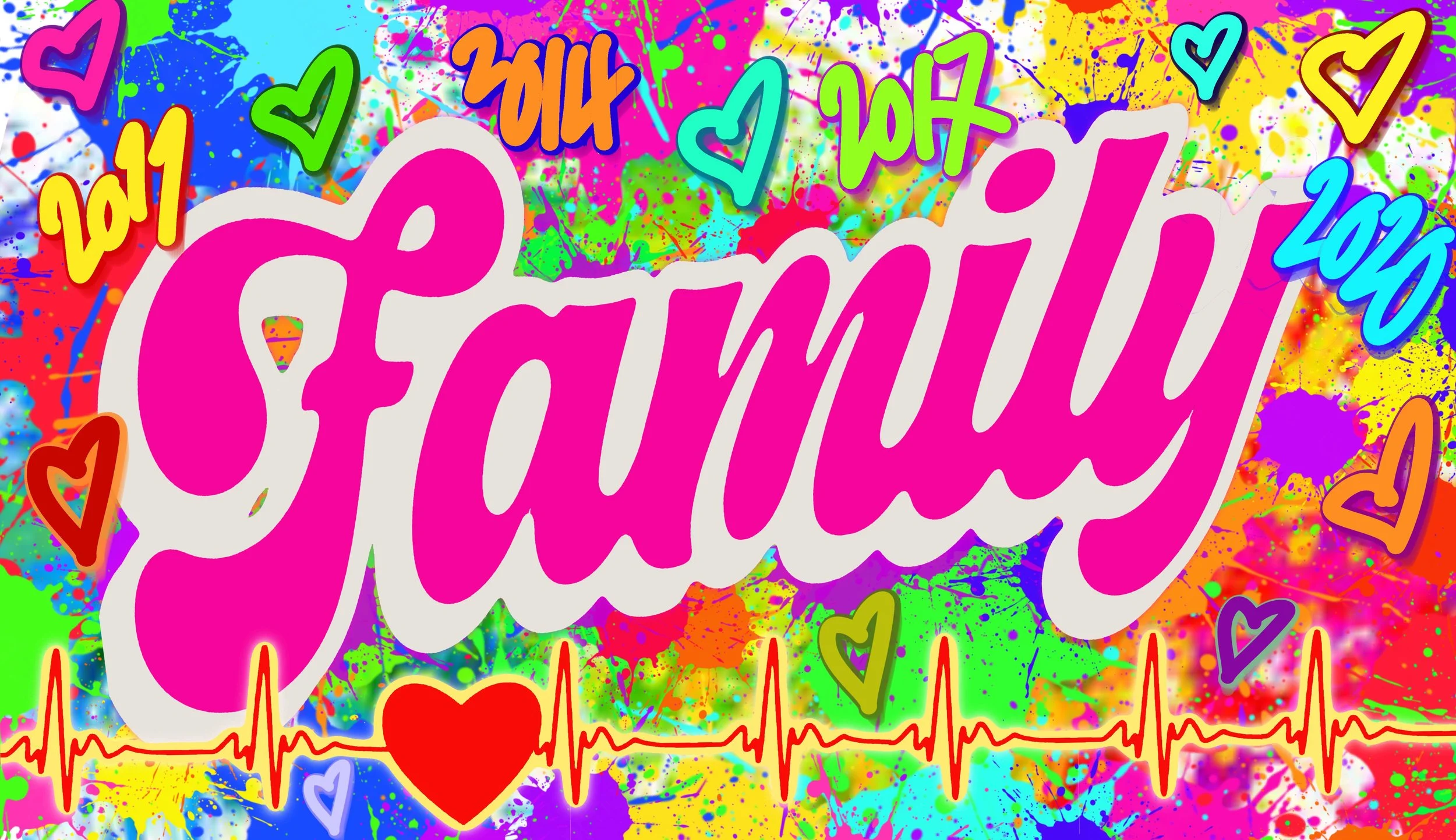
Al’s initial ideas focussed on having a single, large, graffiti style word central to the composition, then surrounding it with other wording that would capture and embody the desired sentiment and attributes of a happy home. The wording would be backdropped by an end to end cacophony of abstract colour, with the all important heartbeat either running below or directly through the whole wall.
The obvious word to use for the main piece was FAMILY but Al was aware that this would need to be legible and clearly readable to all, so traditional or “wild style” graffiti lettering was not really an option here, as it would be too hard to decipher and thus not really appropriate in this instance. As such, he searched for fonts that would be suitable but that he could embellish somewhat so as to keep to the original remit of a graffiti-esque piece of art.
Al also thought that the piece would need a personal touch and, seeing as there were four children in the family, discussed with the Client the idea of including their names on the wall as well. Eventually it was agreed that the years of each child’s birth would be the way to go as it would be slightly more subtle and less intrusive to the overall aesthetic. It was also mentioned that the Client loved the colour pink, so it was also agreed that this would likely be the main colour used for the central wording.
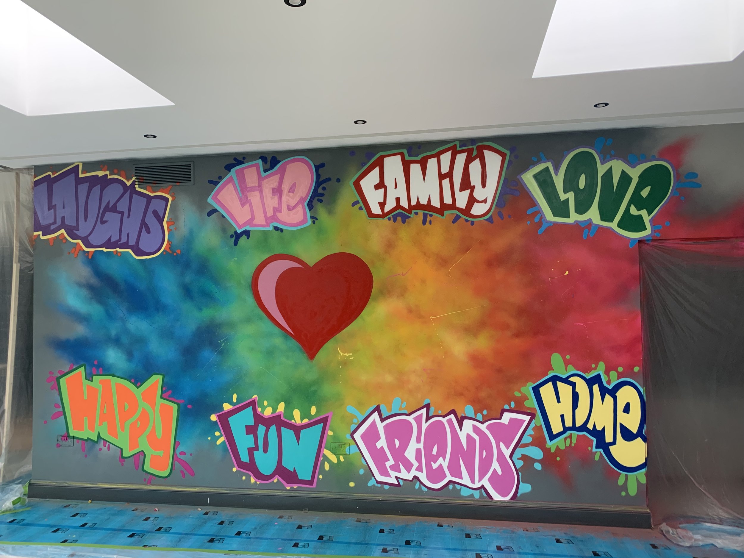
Al provided the Client with a large number of initial designs (just a few of which are shown above) and, after a lot of discussion, it was clear that both parties felt that the large wording was somewhat over-powering and too imposing - causing the other aspects such as the heartbeat, years and surrounding words to become slightly lost and less apparent. It was agreed that the heart should be the central focus with the additional elements increased in size around it. As always, Al wanted this wall to be perfect - so literally went back to the drawing board with a clearer perspective and better idea as to how the finished wall should really look.
The Client decided that they especially loved the third design above, feeling that the heartbeat really stood out and the additional shading on the heart itself added real depth to the wall.
So, the “easy” bit was done - Al now just needed to reproduce this design on the actual wall! Although he had spent many years painting graffiti pieces like this all over the world, Al knew that painting something this detailed, whilst needing to ensure the Client was 100% happy with the end result, would definitely be a challenge. The added pressure of having to paint whilst building works were still ongoing, in addition to the fact this was to be done IN someone’s home - with children, dogs and builders to work around - meant this was not going to be a walk in the park and very different to Al’s previous experiences of just rocking up and painting graffiti on a wall!
Nevertheless, armed with a ventilation mask, a ladder, numerous stencils, masking tapes, dust sheets, an iPad and a serious amount of paint - Al got to work!
The dark grey base coat already applied to the wall provided a perfect, contradicting backdrop to the colourful, “powdered paint explosion” effect that Al had decided would look great as an initial layer, with the pink extending over the door frame on the right hand side.
Once this had been completed, the next thing to do was roughly mark out the heart, as this would be the basis from which all the other elements of the composition would be worked around. Ensuring the overall balance of the wall was essential to avoid the wording looking too bunched up or congested.
Happy with the background, it was time to start sketching up the wording that would really provide a clearer outlook as to how the wall would eventually look. Al knew that this would be a challenging phase of the process as any mistakes would be hard to rectify as the completed background would need to be repainted if he didn’t get it right first time! With the relevant colours for each word strategically laid out and with design in hand, Al balanced himself on the ladder, took a deep breath and applied pressure to the nozzle…
After a couple of days of spraying (accompanied by the sounds of 90’s dance music provided by the builders working hard in other parts of the house) the wall was really starting to take shape. By his own admission, Al had somewhat underestimated the work required to ensure the wall looked exactly as he wanted it to - he knew that any drip or mistake would be magnified - so really took his time to get it right. The Client had gone on holiday by this point, so he was working to a tight deadline in order to have the whole piece completed before they returned. Thankfully, “Terry the Builder” was very accommodating and was willing to put himself out and open up for Al a couple of times in the evening to give him a bit of extra time to get finished.
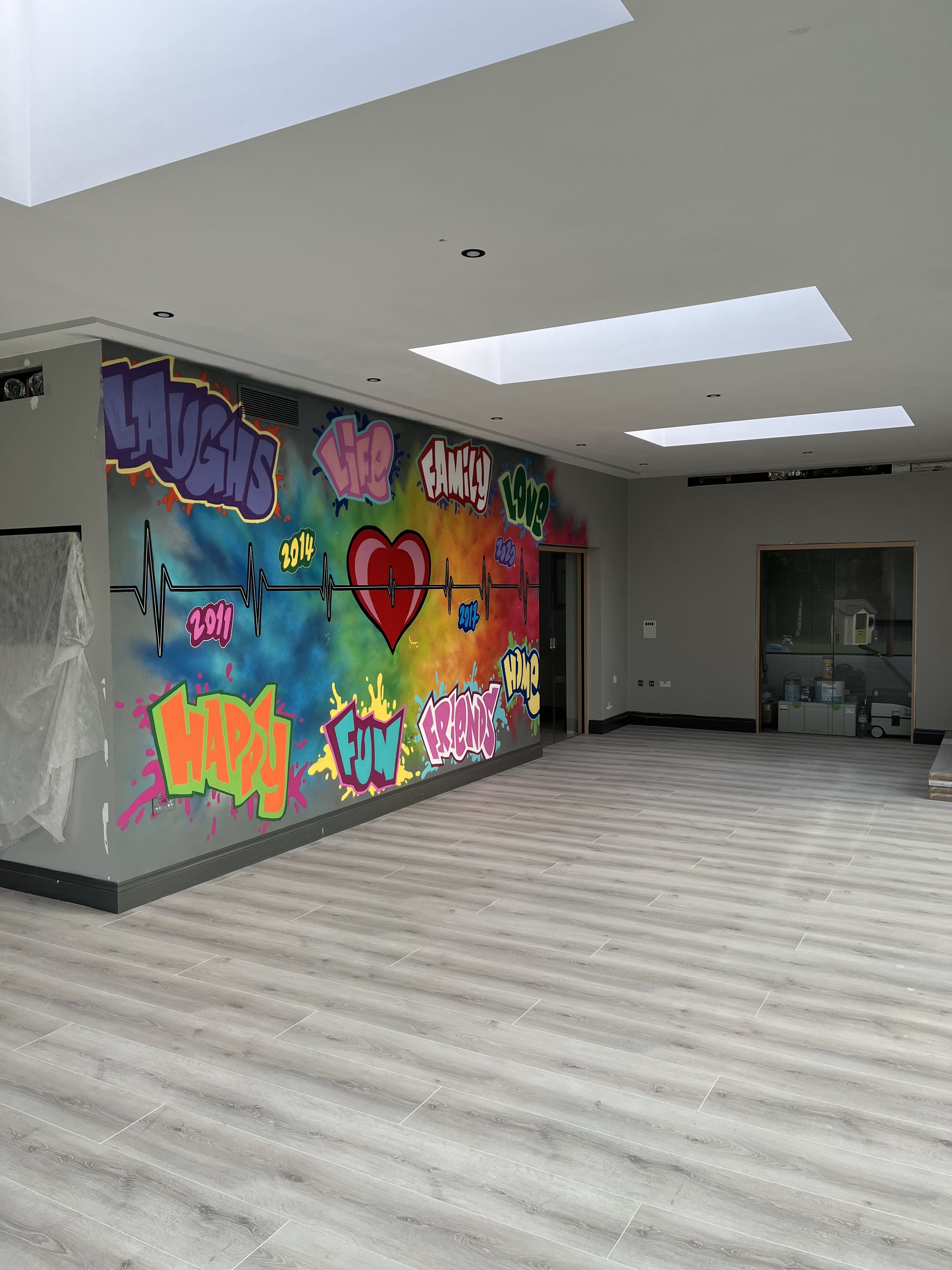
Even so, on the final day, as the Client and her family were packing their suitcases to fly home that evening, Al still had a lot to do! He had decided that to ensure the all important ECG line was 100% accurate and correctly proportioned, the only way to achieve it would be to use individual stencils for each heartbeat. He had made life harder for himself in the original design, by choosing to slightly increase the size of each “beat” as they moved away from the heart itself. Coupled with the fact that each one would need to be equidistant to the next whilst also having to be evenly positioned across the whole wall, this suddenly became a Maths problem rather than a painting session!
After several failed attempts himself, Al was thankfully able to call upon his amazing girlfriend who used her considerably more astute brain to create the required stencils and “together” they eventually managed to successfully add the black section of the ECG before painstakingly adding the inner white line throughout. The final result was well worth the effort and perfectly aligned - even though (as the photos below clearly show) this had really taken it’s toll on Al!
Once the years had been finished and after a bit of cutting back here and there (graffiti speak for tidying up loose ends) the wall was finally finished and it looked great!
It had been an extremely challenging commission for various reasons and Al had learnt some valuable lessons along the way. He had learnt that painting a wall like this in someone’s stunning home (that would be seen EVERY day) was very different to painting a wall in a crappy part of London that no one really other than him would care about! Being a perfectionist and ultimately wanting the Client to be delighted with the finished artwork, meant the process took a bit more time than he had anticipated and came with an unforeseen level of pressure (mainly placed on him by himself!). As such, he would like to thank the various people who encouraged him along the way and really helped him to get the wall finished in time and looking as great as it does!


